
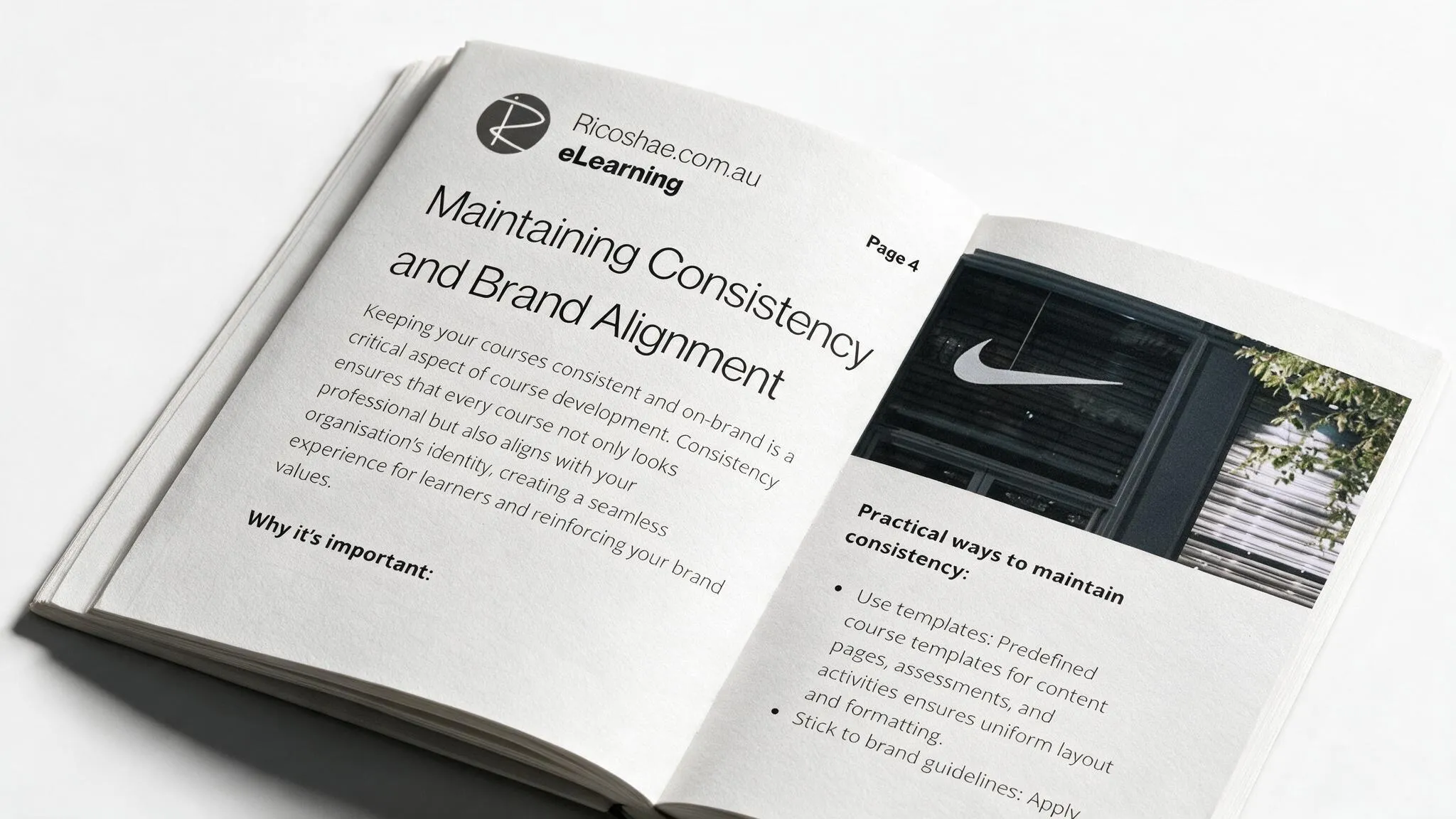
Why Course Consistency Matters More Than You Think
Course branding consistency
Early in my course building days, I inherited a project where every module had clearly been built by a different person, on a different day, in a different mood.
Module one had a clean, modern layout. Module two had headings in a font I’m pretty sure came bundled with Windows 95. Module three, for reasons nobody could explain, had a small clipart dinosaur sitting on the welcome page. I asked around. Nobody claimed the dinosaur. It just was.
Students didn’t complain about the content. The content was actually decent. What they complained about was feeling lost. “Is this still the same course?” one email asked me. Fair question. It didn’t look like it.
That’s it, right there. That’s the whole argument for consistency.
Consistency isn’t about making your course pretty, although it does that too. It’s about giving your learner’s brain one less thing to figure out. Headers that always work the same way. Fonts that don’t change halfway through a topic. Navigation that behaves exactly how it behaved on the last page. When all of that stays the same, your student’s attention goes where it should, on the actual learning. When it doesn’t, some part of their brain is quietly asking “wait, did I click the wrong thing?” on every single page.
Think about walking into a McDonald’s in a town you’ve never been to. You already know where the counter is, roughly what’s on the menu, and how the whole thing works. That’s not an accident. That’s a system, built once and applied everywhere, so nobody has to relearn the basics every time.
Your course needs the same thing. A template for content pages. A template for assessments. Brand colours and fonts locked in before you write a single line. Consistent heading levels, so a student always knows a big heading means a new topic and a smaller one means a subsection, not the other way round on page twelve.
Here’s the bit people skip. Consistency isn’t a “set it and forget it” job. It needs a regular check. Every few modules, go back and compare what you’ve built against your original style guide. Did that heading level creep? Did someone (probably you, at 11pm) use a slightly different shade of blue? Small drifts add up fast, and by module ten, nothing matches module one.
The upside is worth the discipline. A consistent course looks professional. It reinforces your organisation’s brand every single time a student logs in. And honestly, it saves you time too, because once the template exists, you’re not reinventing the layout every time you start a new unit.
Get this right early and you’ll barely think about it again. Get it wrong, and you’ll be the person going back through forty pages trying to remember which shade of blue was the “right” one.
It’s not all about how the course feels to you while you’re building it. It’s about how it feels to the person sitting on the other end, trying to learn. Keep it consistent, and they’ll trust the content because everything around it already earned that trust.
The free guide covers exactly how to set this up properly before you build, including templates, brand checklists, and the review habit that keeps it all on track.
Download the free guide: The Hidden Prep Work No One Tells You About
Course branding consistency