
The One Document That Makes Course Building Actually Easy
Course content document
Remember Untitled1? The document with no headings, a single vague mention of a quiz, and nothing telling me where the images should go?
I sent that one back with about forty questions. Forty. The build stalled for two weeks while we went back and forth over email, me asking “does the quiz go here or here” and the client replying “wherever makes sense,” which, respectfully, is not an answer.
Compare that to a different client, a few months later, who sent me a document that read like an actual blueprint. Clear headings for every topic. Notes in square brackets showing exactly where a quiz, video, or drag-and-drop activity should sit. Under every image reference, a short description of what the image should show. That course was built in about half the time.
Same amount of content, roughly. Completely different experience. The difference wasn’t talent or budget. It was one document, done properly.
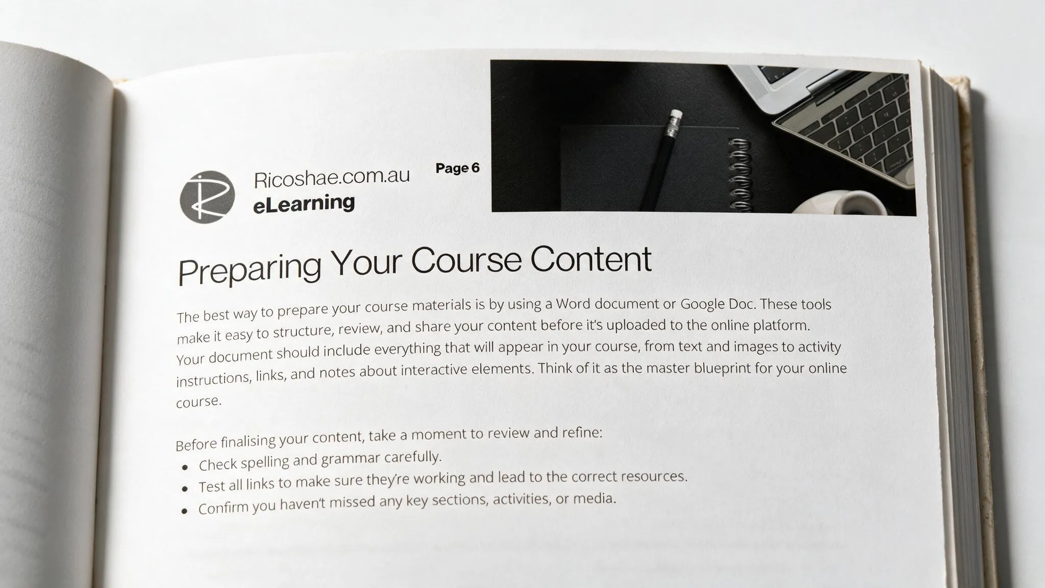
Here’s the thing about your content document, whether it’s a Word file or a Google Doc. It’s not notes for yourself. It’s the master blueprint someone else has to build from, and they can’t read your mind. Everything that will end up in the course needs to actually be in that document. Text, images, activity instructions, links, and clear notes about anything interactive.
Before you send it anywhere, run through it properly. Check the spelling and grammar, not because it needs to be perfect prose, but because typos slow reviewers down and erode confidence in the content. Test every link. Nothing kills momentum faster than a student clicking “watch this video” and landing on a 404 page. Confirm nothing’s missing, no half-written sections, no “add more here later” that never got the more.
Then structure it properly:
Organise logically. Content should follow the actual flow of your course, not the order you happened to think of it in.
Use clear subheadings. These often become page titles once the course is built, so vague ones like “stuff” or “more info” cause real problems down the line. Use page breaks to show where one page ends and the next begins.
Mark your interactive elements clearly. If you want a quiz, a drag-and-drop, or an embedded video, say so, in the document, right where it goes. Don’t leave it as a vague aside.
Highlight anything that could work as an accordion or collapsible section. These are perfect for extra detail or optional reading that would otherwise overwhelm the page.
Indicate visual elements with a short description. “[Insert image: student working on a tablet to illustrate online learning]” tells whoever’s building the course exactly what to look for or create, instead of leaving them guessing.
I think of this document the way I think about a guide track before a proper studio recording. It doesn’t need to be polished. It needs to be clear enough that everyone involved knows exactly what they’re building towards. Skip the guide track, and the whole session takes longer, because everyone’s guessing at the same time.
Get this document right, and the actual course build becomes the easy part. Your developer or learning designer has everything they need in one place, and you’re not fielding forty confused emails two weeks before your launch date.
The free guide includes the full checklist and a walk-through of exactly how to structure this document before you send it anywhere.
Download: The Hidden Prep Work No One Tells You About
Course content document