
How to Choose Colours for Your Online Course (Without the Guesswork)
Online course colour palette
Someone once sent me a colour palette for their new course. Seven colours. Seven “brand colours,” they called them, all listed with equal importance on the welcome page.
It looked like a toddler had gotten hold of the highlighter set and decided every single one deserved a turn. Body text disappeared into the background. The “next” button was the exact same shade as a heading three lines above it. I genuinely couldn’t find where to click, and I’d built the thing.
Now I’m not a designer by trade, but isn’t that what colour theory is for?
Here’s what I’ve learnt about picking colours for a course, and it’s simpler than people make it out to be.
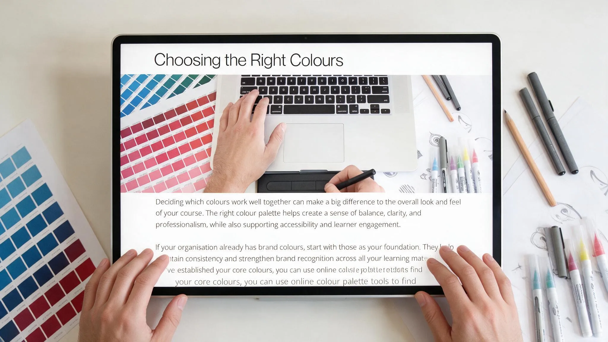
If your organisation already has brand colours, use them. Don’t reinvent anything. Those colours already carry recognition, and recognition is worth more than whatever trendy palette you found on Pinterest last night. Build out from there, using an actual colour tool (Coolors and Colour Hunt are both free and easy) to find complementary tones, accents, and backgrounds that work with what you’ve already got, not against it.
If you’re starting from scratch, pick one base colour. Just one. Then let a proper colour tool show you the harmonious options, complementary, analogous, or triadic, depending on the mood you’re after. This isn’t guesswork dressed up as creativity. It’s colour theory doing the heavy lifting for you.
A few rules I stick to on every single project:
Keep your overall palette to three to five colours. Every colour you add past that is one more thing fighting for attention, and attention is the one resource your course can’t afford to waste.
Maintain high contrast between text and background. If you have to squint, so will your students, and squinting is not a learning strategy.
Use accent colours sparingly. One bright colour, saved only for buttons or key highlights, does more work than five bright colours spread evenly across the page. If everything is highlighted, nothing is.
There’s a practical side to this too, the one people forget. Accessibility isn’t optional. Poor contrast doesn’t just look average, it locks out learners with low vision or colour blindness. Getting your palette right the first time isn’t just about looking professional. It’s about making sure everyone who signs up can actually read the thing.
I like to think of it the way I’d think about mixing a song. You don’t turn every instrument up to full volume and hope it sounds good. You decide what needs to sit forward, what sits back, and you leave space for the important bits to actually be heard. Colour works the same way on a page. Decide what needs to stand out, then get out of its way.
Get your palette locked in before you build a single page, and you’ll never have to go back and repaint the whole course because the “next” button kept disappearing.
The free guide walks through the exact tools and steps, plus links to the colour resources I use on every project.
Download the free guide: The Hidden Prep Work No One Tells You About