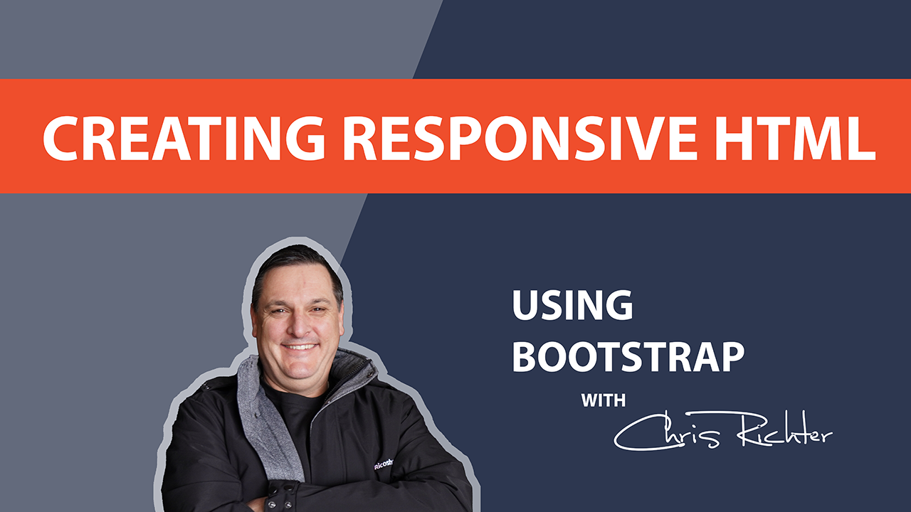
Creating Responsive HTML Using Bootstrap in Moodle
It benefits you and your students
In this course, you will learn the basics of using the Bootstrap classes and how to create responsive web pages using Bootstrap. We’ll cover everything from basic Bootstrap components to creating responsive grids and cards.
You will learn how to:
- Use Bootstrap’s grid system to create responsive layouts
- Use Bootstrap’s components to style content
- Make images and videos responsive
By the end of this course, you will have the skills and knowledge needed to create responsive HTML pages using Bootstrap. You’ll be able to build pages that look great on all devices, from desktops to smartphones.
Our course is taught by Chris Richter, an experienced web developer who has been working with Bootstrap for years. You’ll receive hands-on training and learn the best practices for creating responsive web content.
Enrol now and take the first step towards creating beautiful, responsive web pages with Bootstrap! Our course is easy to follow, and you’ll be able to start creating responsive web pages in no time! Don’t miss out on this opportunity to learn how to create responsive HTML using Bootstrap!